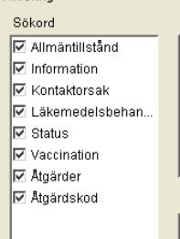
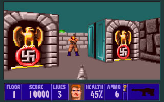
 One of the medical applications I’ve had to use a lot has some really obnoxious user interface tricks. One of the worst is the following. There’s a window where you can set filtering requirements for what elements you want to see in the journal notes. It consists of a number of group boxes, each with a number of items, each with a checkbox to enable or disable it. One screen can easily hold more than 50 such line items. All are enabled by default. There’s no button “clear all” at any level, so I always patiently unchecked the whole enchilada, one by one, before selecting the one or two items I actually wanted to enable. Needless to say, I wasn’t an enthousiastic or frequent user of said form. By pure coincidence, I found out that there is a “clear all” / “select all” function. You simply click the group box label (the “Sökord” word on top). Think about this for a minute… how the f*** was the user supposed to guess that??! This reminds me of Wolfenstein 3D, were there was no other way to find the secret compartments than to run around clicking every part of every wall in every room.
Moral of the story: don’t invent your own UI elements.
Skip to content

Not really apologetic