A call to (telescopic) arms

Medical technology is evolving and one particular area where a lot is happening is in robotic surgery. By moving the surgeon a couple of feet away from the operating table and into a comfy chair, we accomplish a few goals: relaxed surgeon, better view using keyhole techniques, filtering of movements, etc. But it’s only a step on the way to telesurgery and that is where the real benefits reside. Imagine, for instance, to be able to get the best surgeon for a procedure independent of the location, any time of the day or the night. Or to get any surgeon at all, for that matter, to operate at the scene of an accident or in a little village somewhere. All you need is the robot on the spot and a good network connection. And that’s where we run into trouble.

The requirements on the network we need for telesurgery are pretty horrific and no current network, as far as I know, is designed to fulfill any such requirements. The network needs to be absolutely secure, and by that I mean it needs to be very resistant to breakage, to delays, and that it must ensure data integrity at all times. It also needs to protect privacy, of course, but that’s almost an after-thought.

For us security people, the telemedicine networks is a new challenge and one I think we should spend more effort specifying and creating. For instance, we need to find a way to ensure the following characteristics:

Max latency

For instance, we know that turnaround delays above a hundred milliseconds or so make telesurgery very difficult and dangerous.

Redundancy and resilience

Obviously, we don’t want the network to go AWOL during an operation. And if it does, we need to fail safe. Both the surgical instruments and the procedure as such need to fail in a safe manner.

Integrity

The data integrity is of utmost importance. When we want a 3 mm incision, we don’t want that to turn into 3 meters by accident.

Authentication

We want to make sure only the right surgeon is on the line.

Discussion

The above is just a few issues I could think of right off the bat. Internet protocol, for instance, is well suited to the resilience requirement, but its lack of guaranteed time of delivery is a problem. I do think we need a separate network that has the desired functionality and characteristics, and that may in part be based on current protocols and infrastructure. I do think, however, that the problem hasn’t yet been attacked on a holistic level. I’m also sure that the current Internet structure will not suffice to carry telemedicine applications. In other words, it’s time we looked over these requirements and started coming up with real solutions, else the next step in the evolution of medicine will not get started.

Who stole my signature?

It’s high time we got our signatures back. Since IT systems were introduced in healthcare, handwritten signatures have lost all importance, not because they’re superfluous, but because the IT application vendors can’t get a grip on how to implement them. And the weird thing is that all of us, including the authorities, just let this go on with hardly a notice. In fact, we’ve regressed more than a hundred years as far as this issue is concerned and we’re ok with that?

We need digital signatures in our healthcare applications and we need them badly. As things are now, we sign journal entries and prescriptions with just a mouse-click (or ten mouse-clicks in some apps, you know who you are). If you prescribe heavy analgetics or sedatives you need to prescribe on special numbered forms and add your own personalized sticker (in Sweden), but if it’s electronic you just click. Anyone can do that if they find a way to log in as me. Almost anyone can do that if they can get an SQL command line to the database. How am I to defend myself against allegations that I prescribed something bad or entered a stupid note on a patient if this is how the system works? I can’t!

We trust the application and by implications its developers. The developers trust the OS and the IT department running the app and all this trust is totally misplaced and nothing is verified. The applications regularly misplace notes and change content due to bugs, and still we trust them?

Technically, there’s only one decent solution today and that’s digital signatures based on assymetric crypto systems. It’s not that difficult to implement and we don’t even need a very extensive public key infrastructure (PKI). All we need is the keys and a local certification authority (CA).

The keys have to be created on a USB dongle or a smart card and the private keys should never leave it. The local workstation could do the processing, but once better USB dongles or smart cards are easily available, the processing should be moved to those. That’s all pretty easy since all modern operating system support all this so the applications don’t need to.

It’s also important that the signature is applied to two structures: the machine data and a bitmap of the same data as it would have looked on paper. The machine data by necessity is incomplete and its interpretation dependent on external information and the application intended to process it. For example: it’s entirely possible that a prescription or a lab request contains only codes for the products or tests, while external tables that are not part of the signed data structure contain the corresponding product or test name. That means that I may put my signature on a prescription for the code for aspirin today, but which could turn into a prescription for methadon if combined with another external table, without invalidating my digital signature. If, on the other hand, the accompanying bitmap showed an oldfashioned paper prescription for aspirin, I could use that as (almost) human readable proof of what I actually signed any time in the future.

I think it’s not too much asked that the vendors get their asses moving and get this thing done.

Twisted keyboards

I’m often working as a GP in Sweden. The desktop computers we get are usually bog standard Dells, with all the excitement that goes with that…. not! (Think Borat.) All of them alike: boring but almost adequate. You can sit down at any one of them and start blindly typing away into the electronic patient records without a second thought. The only thing marring the experience is the intermittent but constant swearing at the software, both EHR and Windows, but it’s something that becomes a part of you. I think even the patients are getting used to it.

For some reason, and it has to be sadism, Dell makes two very similar kinds of keyboards where the only noticeable difference is the orientation of the Ins/Del/PgUp/PgDn/Home/End keypad above the arrow keys. The regular orientation is horizontal, that is two rows of three keys, right? Well, the alternative is a sicko three rows of two keys.

The IT department, naturally, has ordered a mix of these two types, just to keep things interesting. So there you are, typing away happily with the cursor skipping to all kinds of places you didn’t intend, until you discover some %#$&$# SOB moved the keys around!

I can understand that some people may want the alternate layout for their machines, but we’re talking about a large number of bog standard machines here, and users moving from one to the next all the time.

How ^%$#$(* idiotic do you have to be to do this to your users?!?

More, but in Swedish

I’ve been a bit quiet lately, but that’s here only. I’m spending most of my writing energy on a new blog over here that allows me to relieve myself of a lot of the frustrations I have about the rotten state of medical software. I’m one of the site’s “official bloggers”, whatever that means. If you can read Swedish, and if you like seeing me suffer while having to use some good, some mediocre, and some really crappy software as I see patients, I’d love it if you’d visit that blog, too.

Amazing UI (1)

I figured I could start a series on “amazing UI” elements. Admittedly, practically all come from the multimillion electronic healthcare app I’m subjected to with frightening regularity. Just have a gander at this… note the expanse of grey to the right and the memo field with scroll bars squeezed into the upper part, with some illegible text in it. This is supposed to convey a description of an important warning about the patient. I usually try to be sanguine about it, but you really have to be retarded to design interfaces like this.

varning

UI to behold

Another user interface in a medical journal app, that I simply can’t let go by unremarked. I don’t think I’ve seen this kind of “inspired” (de-spired?) layout since the Visual Basic 1.0 cowboy days. You’d think that this would be your niece’s attempt at producing a form, but no, it’s a multimillion dollar electronic healthcare records app we’re talking about here. And this is an update to it. New and improved!

Screen shot of bad UI

These people claim they have a trained UI specialist on staff. They’ve never said what they have him or her doing, though. The dishes?

Bad UI: it’s the customers own fault! Sometimes…

I’ve always been amazed at how bad vendors are at producing decent user interfaces for vertical apps in medicine. Not that I think they’re any better in other areas, but this is the domain I’m exposed to most. The other day I got a document with requirements for a new system that the Swedish social services want made and it’s a subject of public tender. They present the requirements as a document with screenshots from a prototype app to illustrate what they want. Now, that is a spectacularly bad idea in itself, but not the subject of today’s rant, except coincidentally.
In these screenshots, and in the prototype app, they actually demonstrate one of the worst user interfaces I’ve ever seen. They invent new UI tricks, they slap on buttons and labels that make no sense and they show a workflow from hell. OTOH, I do know a vendor or two who would feel totally at home producing this crapola for them. Let me just give a few examples.

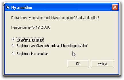
The dialog box above opens after a new application for social services has been filled in and has three radiobuttons, translated as:

  • “Register application”
  • “Register application and assign to handler”
  • “Do not register application”
  • The two buttons on the box are “OK” and “Cancel”.

    The text that follows the illustration in the requirements document explains what should happen:

    “Register application”: The application is registered/saved and the user is himself made handler for this application/incident.

    “Register application and assign handler”: The application is registered/saved and the user can assign somebody else as handler, but remains responsible as long as the assignee has not accepted responsibility, except if the assignee is a manager, in which case the assignment goes through even without him accepting it.

    “Do not register application”: The application is saved, but not linked to a particular applicant.

    Masterful… simply masterful. Not one of the three radiobuttons actually mean what they say. I especially love the “Do not register” that actually does save the document but in a special way.

    Oh, so what do you click when you don’t want to save your entries at all? “Cancel”? The close button at the top right? Who knows… nothing is said about that. Personally, I’d probably pull the plug and reboot.

    Now, look at this:

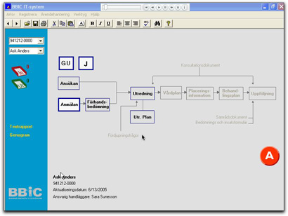
    This is one of the main screens. It shows the documents in a “case”. “GU” means something special, I forgot what. “J” probably means “Journal”, which is what it sounds like. Grey documents can’t be entered. Black text, thin edge, can be created. A document with a thick blue edge has been filled in, at least partially. Thick red edge (none in this illustration) are locked. The big round red “A” button down to the right is clicked to close a “case”. Once the case is closed, all documents are locked and can’t be edited or added to. You can back out of the “A” within a certain time period; the document text suggests until midnight.

    Do I need to groan for you, or do you want to handle that part yourselves?

    I was planning on going through a lot more of this requirements document, but I simply can’t handle it. It’s overflowing my registers. This kind of thing goes on and on.

    In conclusion, what is all this? Well, it’s a requirements document at least as bad as the worst software vendors can dump on users. Except this represents what the users actually are asking for. Except I don’t believe that. I believe it’s the IT department that likes to do prototypes. So, what should they have done?

    1. Do not specify solutions in requirements documents!
    2. Do stick with UI standards. Don’t ever invent your own “cute little tricks” or “big round red buttons”.
    3. If you need to explain in text what a dialog text actually means, the dialog text is wrong!

    If you get a document like this on your desk, you can only ask to be allowed to redo the requirements gathering. Or run screaming in the other direction. You can’t build a system like this. You will only be able to satisfy the requirements by creating junk, which they won’t pay for, or create a good app, which won’t satisfy the requirements, so they won’t pay for that either.

    The IT in healthcare gap

    Today I got a questionnaire in the email asking for my opinion on a planned website for IT in healthcare. And, naturally, the questions were extremely biased. They asked things like:

    “How important is it to be able to get information on new IT technology through the site?”

    “How can we improve the understanding of IT among healthcare workers?”

    “How can we make it easier to healthcare workers to learn about new technology?”

    etc, and so on ad nauseam.

    Not once did anything point to “how can we make IT people understand healthcare any better?”, only the opposite: “how can we make healthcare staff understand IT better?”. This is so wrong.

    I’ve been in both IT and healthcare for more years than I care to admit, and that attitude may have been reasonable ten years ago or more. Today, practically all the problems I see are caused by lack of domain knowledge among IT workers. Healthcare people have learned how to work with computers, but computer people have learned nothing about healthcare. They (“we”) keep producing solutions that don’t fit the requirements. Hardly any IT workers know anything useful at all about healthcare, and still they produce the IT solutions that healthcare workers must use.

    Time and again, when IT solutions fail, they sit down and scratch their heads wondering why the healthcare people are so obtuse and can’t seem to work with their solutions. Hardly ever do they consider that their IT solutions may be wrong.

    So, folks, listen up: if your brand new healthcare IT solution doesn’t take the healthcare world by storm, or even gets spat upon, rest assured that you produced the wrong solution. Don’t assume the healthcare people are IT illiterates and that a little extra training will do the trick. That is practically never the answer.

    So, what about that site? Well, if they don’t at least consider the possibility that IT folks may not know all they need to know, they won’t improve things one bit. It’ll be just one more forum for IT folks to hang around complaining about how stupid users can be.

    Really Stupid UI Tricks

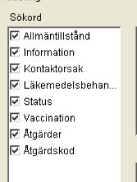
    One of the medical applications I’ve had to use a lot has some really obnoxious user interface tricks. One of the worst is the following. There’s a window where you can set filtering requirements for what elements you want to see in the journal notes. It consists of a number of group boxes, each with a number of items, each with a checkbox to enable or disable it. One screen can easily hold more than 50 such line items. All are enabled by default. There’s no button “clear all” at any level, so I always patiently unchecked the whole enchilada, one by one, before selecting the one or two items I actually wanted to enable. Needless to say, I wasn’t an enthousiastic or frequent user of said form. By pure coincidence, I found out that there is a “clear all” / “select all” function. You simply click the group box label (the “Sökord” word on top). Think about this for a minute… how the f*** was the user supposed to guess that??! This reminds me of Wolfenstein 3D, were there was no other way to find the secret compartments than to run around clicking every part of every wall in every room.
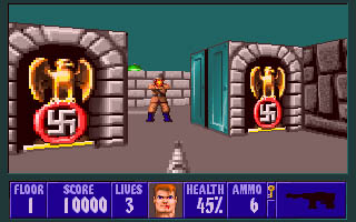
    Moral of the story: don’t invent your own UI elements.